1. Inside Wivai: CaixaBank's Premium E-commerce
CaixaBank has 5,397 branches to serve its 15.8 million customers, and has the most extensive branch network in the Spanish market. It is Spain's third-largest lender by market value, after Banco Santander and BBVA.
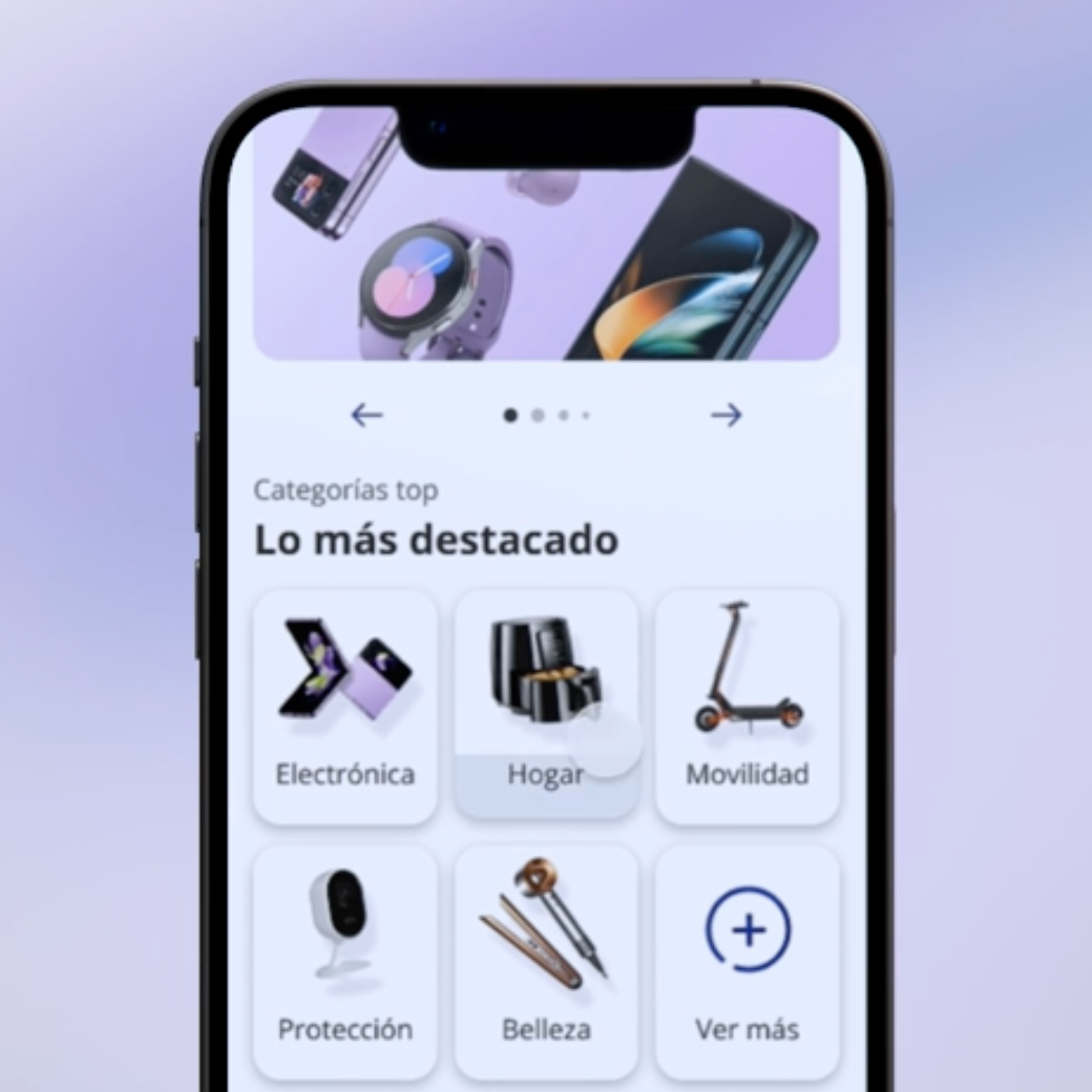
Wivai is CaixaBank's selectplace (marketplace with products of selected brands) in which the bank offers its non-financial products.
It offers premium products with an average ticket of more than €800.
The advantages offered to the user are the ability to finance purchases at 0%TAE with Caixabank, in addition to being able to access added products such as insurance or other complements. This financing is done by connecting Wivai with the customer's financial data and thus estimating the user's capacity to finance their purchases.
My role in this project focused on leading the second biggest selling environment for Wivai: CaixaBank Now App.
2. Within Now
Now is the environment for Caixabank users, which you can access only if you have a CaixaBank account. There are 3 channels: Desktop, Android and iOS.
👁 Vision
Promote the sale of Wivai products through organic exposure through the Now App.
👤User Profile
Anyone with a Caixabank account can access the Wivai space. The typical users are women and men between 30-50 years old.
Within the environment the payment methods change depending on the limit set for the user. This limit is measured by Caixabank according to their bank standards (if the user has a mortgage, salary, etc...), which creates a curated an personalized shopping experience.
💚 Advantages
- Being within Caixabank Now, there is more exposure organically to the site.
- Users may prefer to buy through Caixabank because of the security it gives them.
- It is the only channel with access to CaixaBank's user testing platform. It is mandatory to test all new features implemented, so it gives us designers the opportunity to support our decisions (for stakeholders) with real users. It also gives us the opportunity to explore functionalities hand in hand with the user to make the best design and business decisions.
💔 Disadvantages
- Being within Caixabank, it has many limitations in terms of Design System, legal audits and technical requirements. It is therefore very important to be clear about all these points before starting the projects.
- Since 2024 there is a reduced budget to dedicate to the Initiatives, so new projects and omnichannel alignment are very subject to the budget capacity and the blocking of existing Initiatives.
- Since 2024 there is a reduced budget to dedicate to the Initiatives, so new projects and omnichannel alignment are very subject to the budget capacity and the blocking of existing Initiatives.
🛠️ Tools & Methodologies
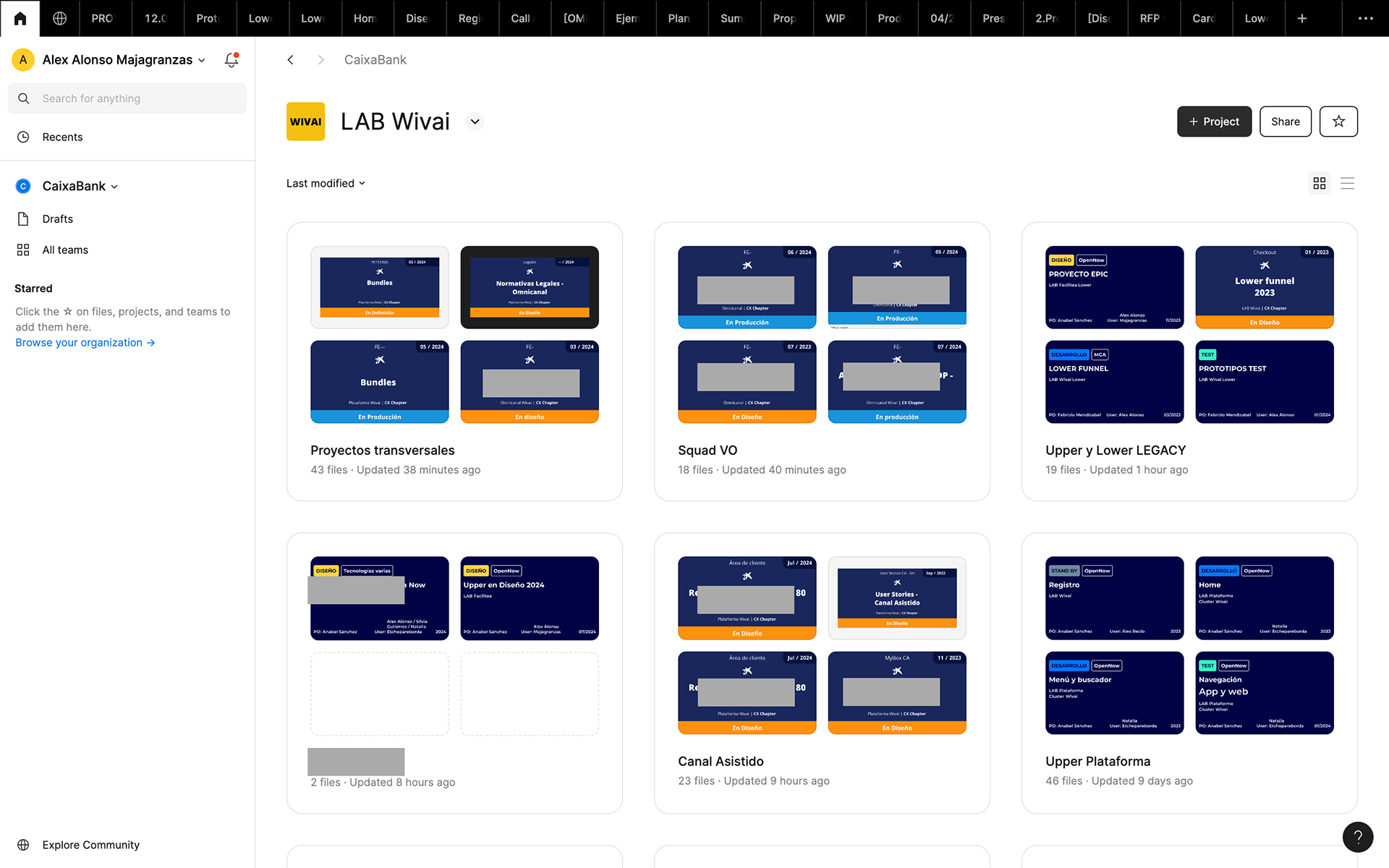
UX & Prototyping: Figma
Agile: Rally
Repository: Confluence
User testing: Teams, Maze, Attention Insights, User Zoom, others.
Benchmark
Ideation techniques & workshops
Accesibility checking tools & plugins
Adobe Analytics
🔁 Workflow
Because it is a channel with many dependencies it is crucial to have as soon as possible a clear vision of the project and the needs to reach the stipulated date of each project.
0- Organize the backlog with CRO/PO for the sprint
1- Comment with Wivai UX peers → To ensure an omnichanel experience, it is important to be aligned with Wivai's other selling environments
2- Review DS components
3 - User testing→ both Validation and Discovery.
4- Legal requirements
4- Validation with Caixa UX Copy Team
5- Accessibility analysis
6- Refinement
8- Development
9- QA
10- Update Figmas
