📖Context
Due to a global trend in the relationship between customers and companies with a large volume of users, the need to transform CaixaBank Now into a SuperApp is proposed by CaixaBank's management. It would become a digital ecosystem with different communities that can meet different user needs: "All in one place".
These communities will offer products and services, for customers and non-customers, where the value proposition will always start from a financial offer.
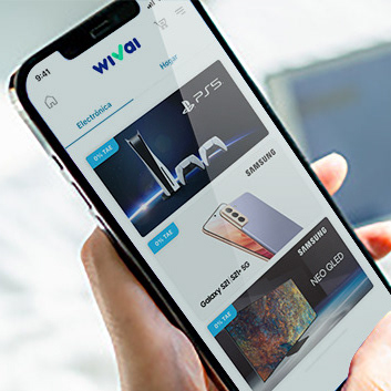
The first community to be developed is Wivai, CaixaBank's E-commerce.
For the MVP, the new design will be implemented in all areas of the product except for the checkout and shopping cart, which will be shifted in a parallel project to space out development.
✴️ Key user journeys
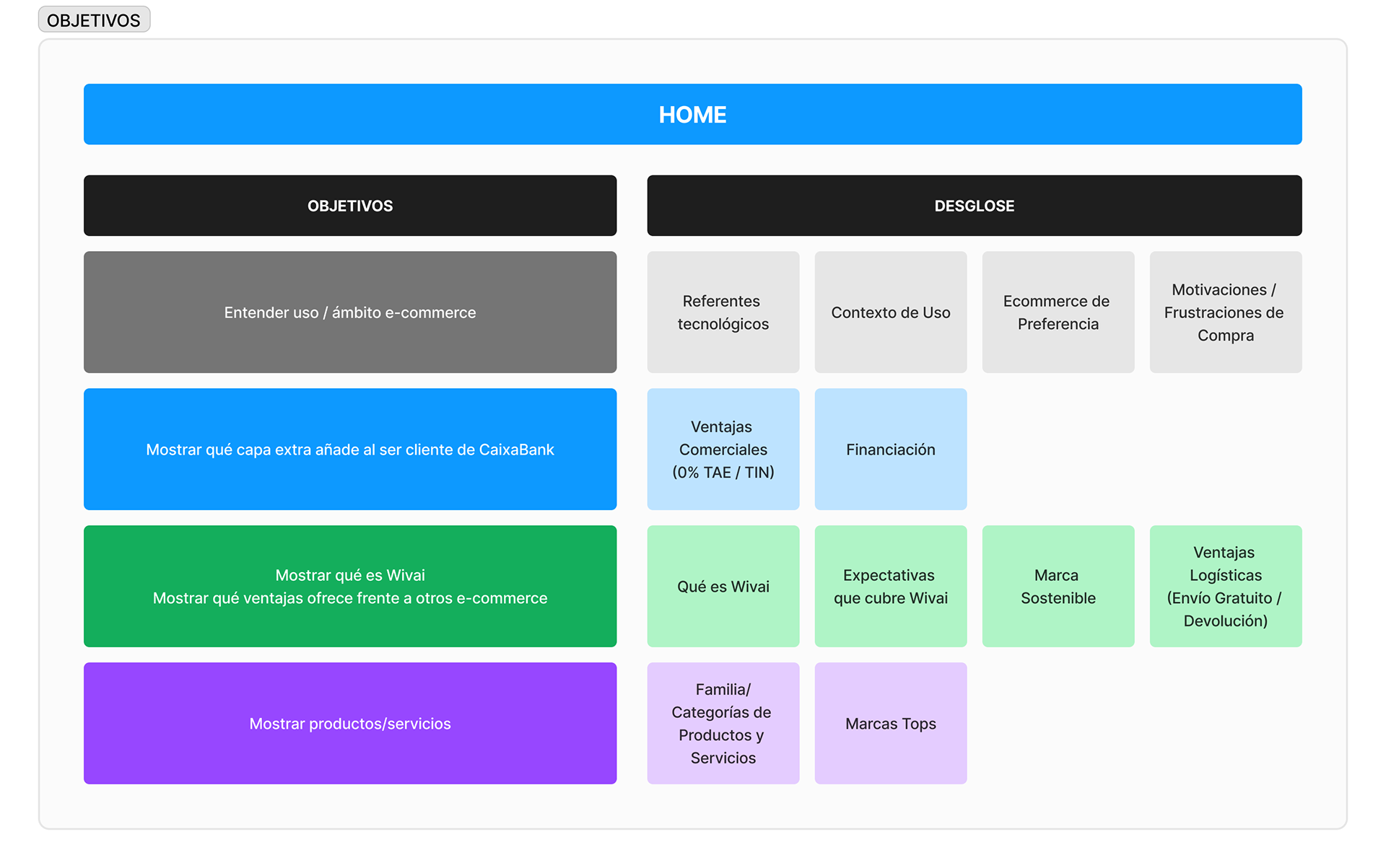
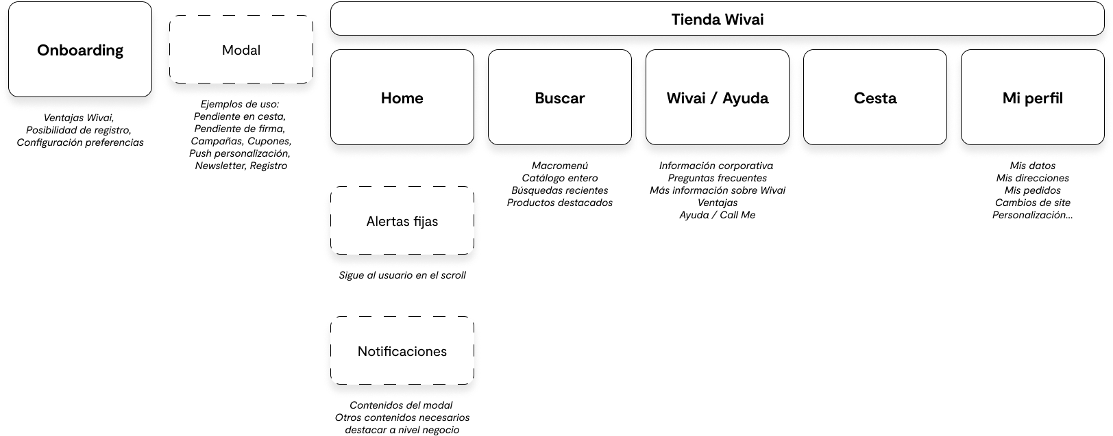
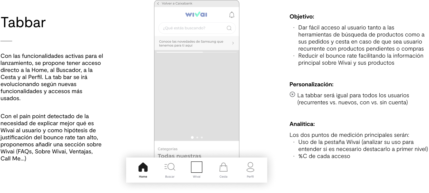
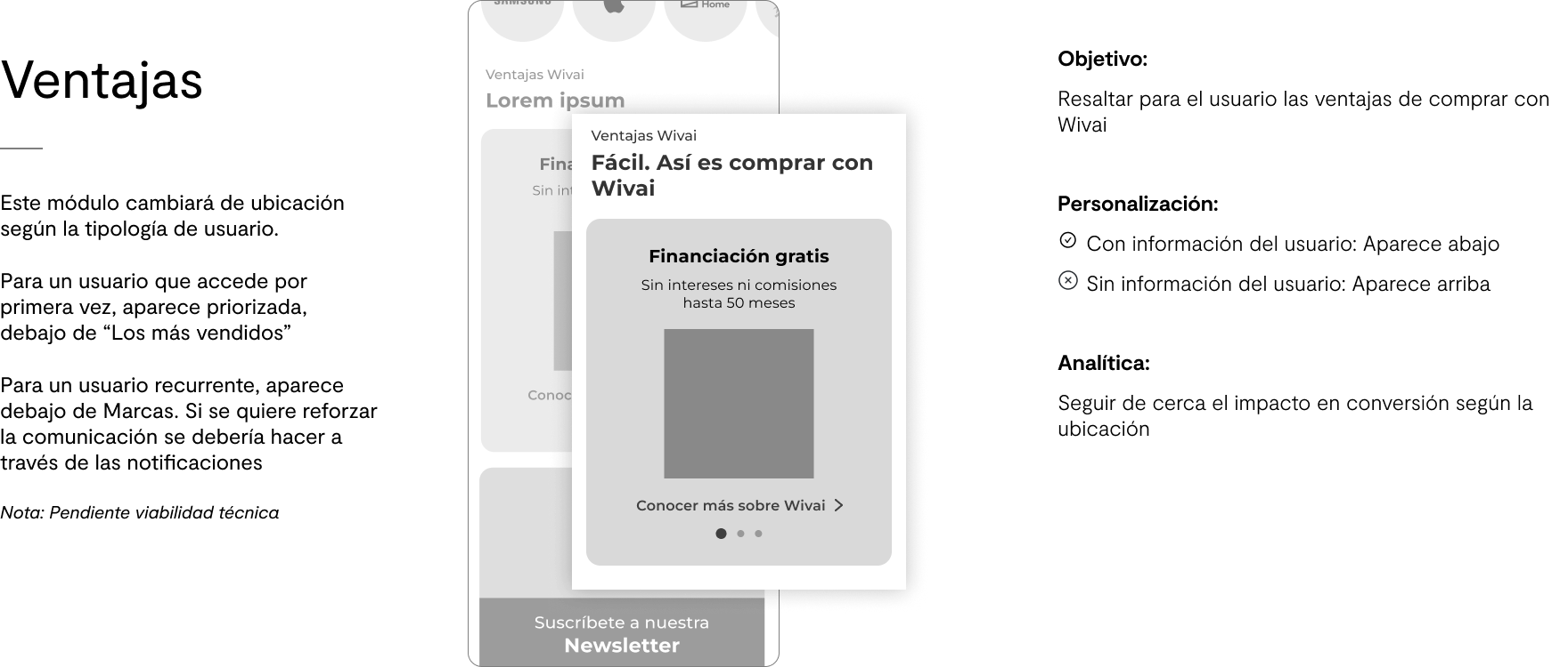
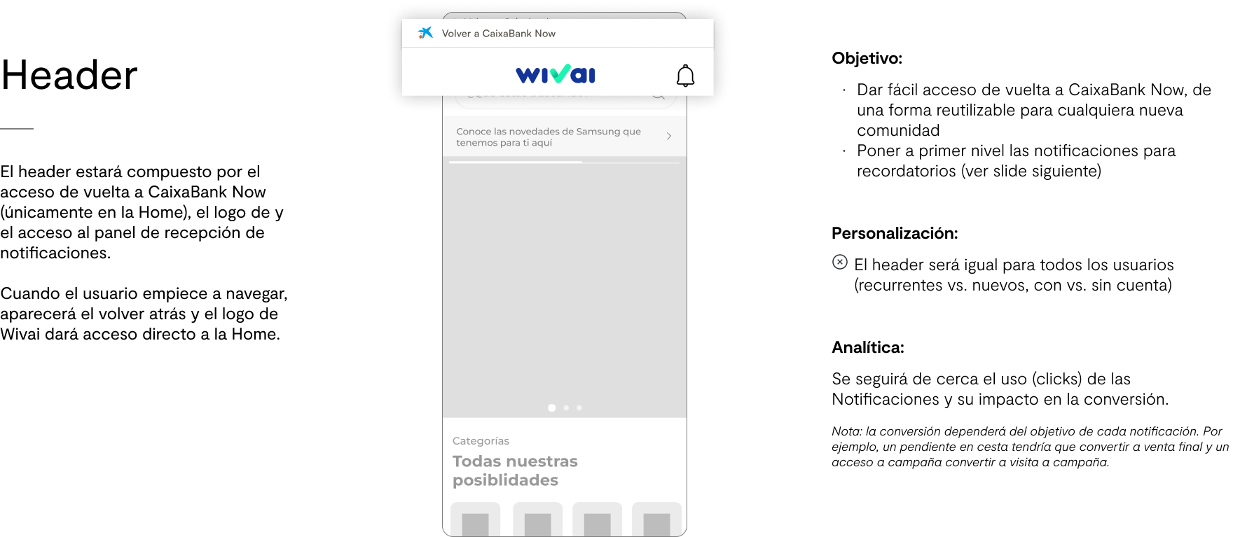
Home
Macro-Menu
Product Catalog
Product Page
Landings minisites
Another important component of this project is a new tagging (Adobe Analytics) of the digital product to measure user interactions, conversion rates, and continuously improving through data driven decisions.
___________________________________________________________________________
🔀Workflow
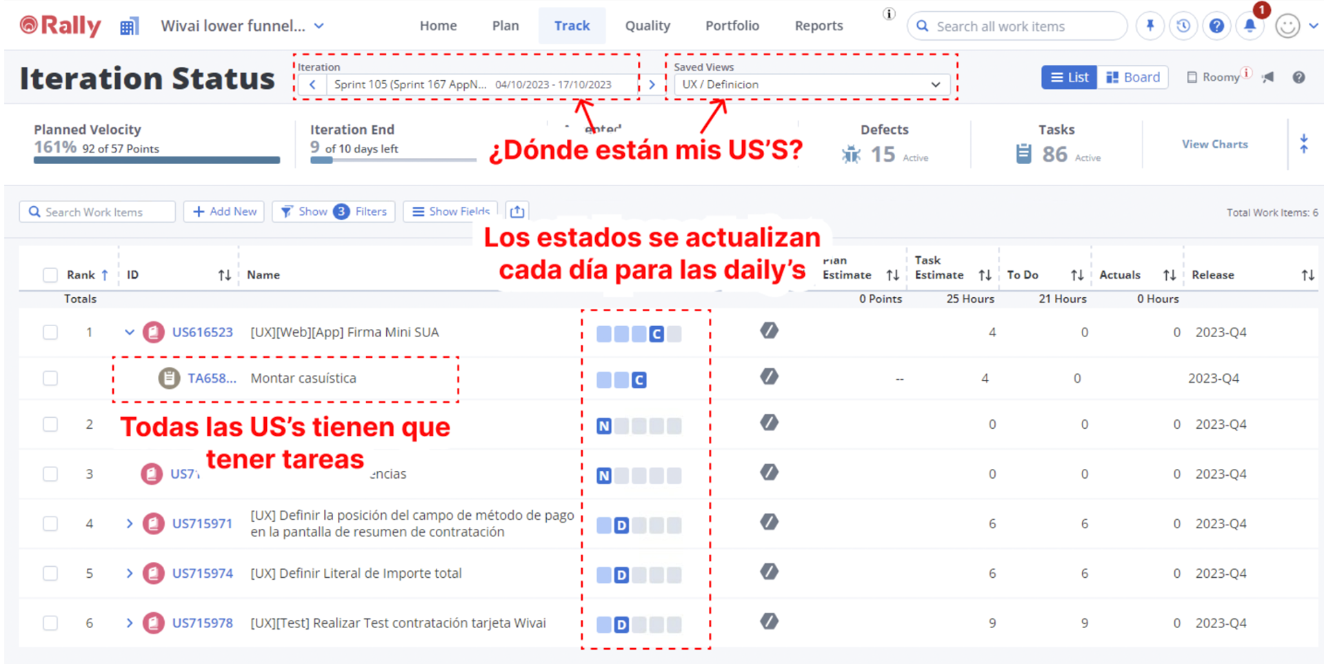
The work during this project was organized in two-week sprints. At the begging of these, it was my job to arrange with the tech and business team about which priorities we'll be tackling during the next sprint, what initiatives require user testing, general status of the project, and which new developments require design QA before being approved for release. We used Rally to organize work, and have a visual representation of the project status, and Confluence to document the work.
___________________________________________________________________________
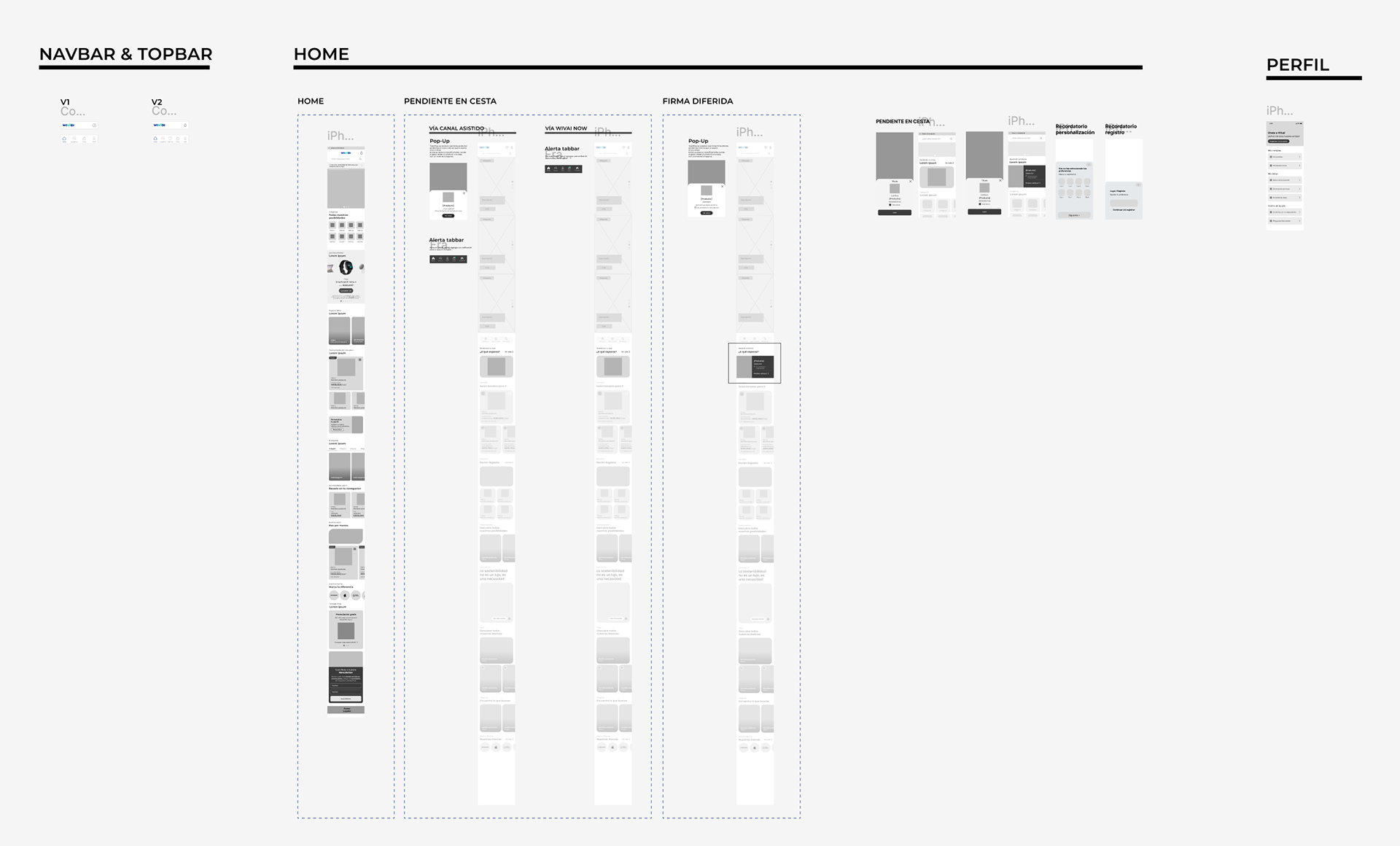
🏠Design of the Home
🧠Ideation dynamic
Arquitectura

Secciones de la Home
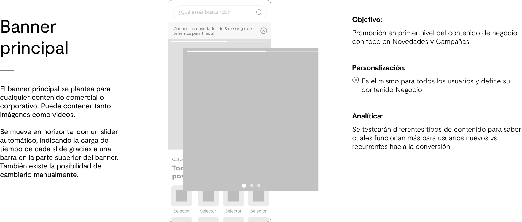
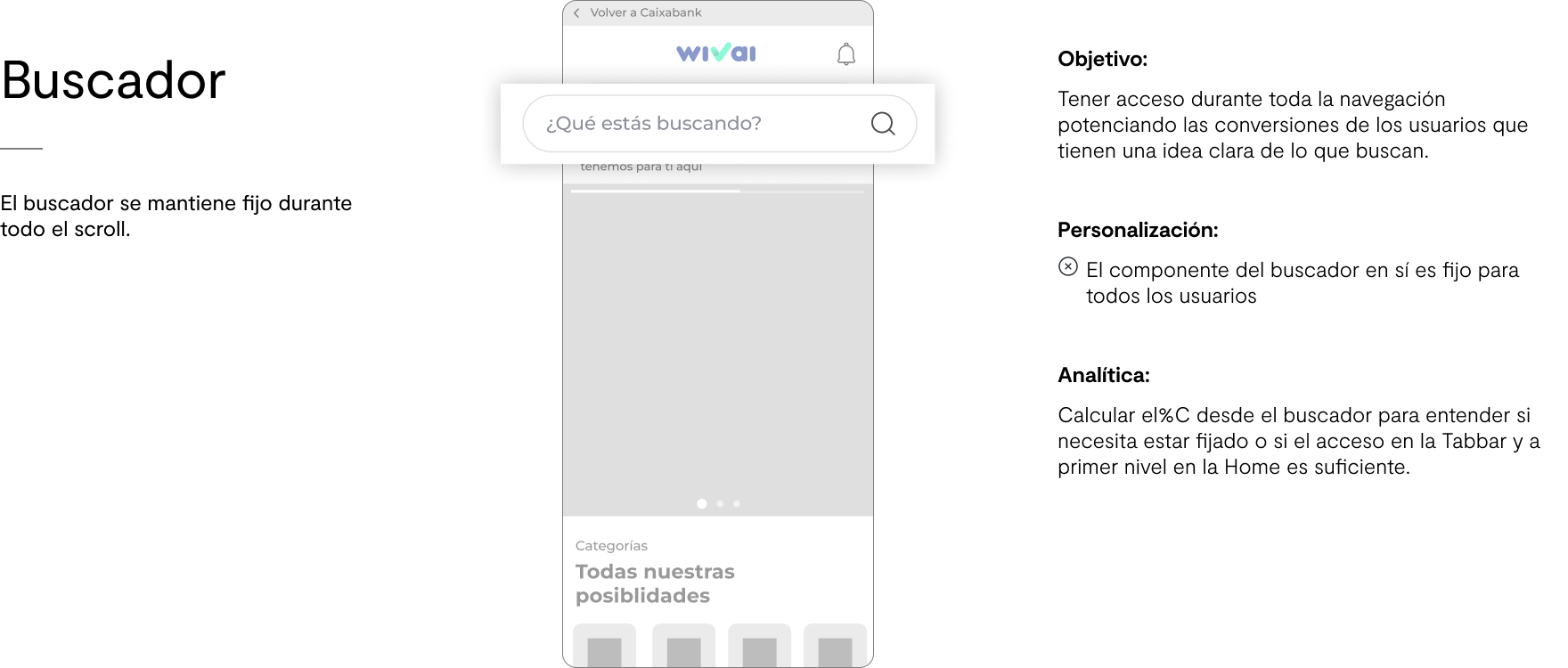
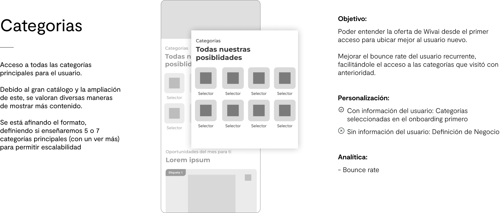

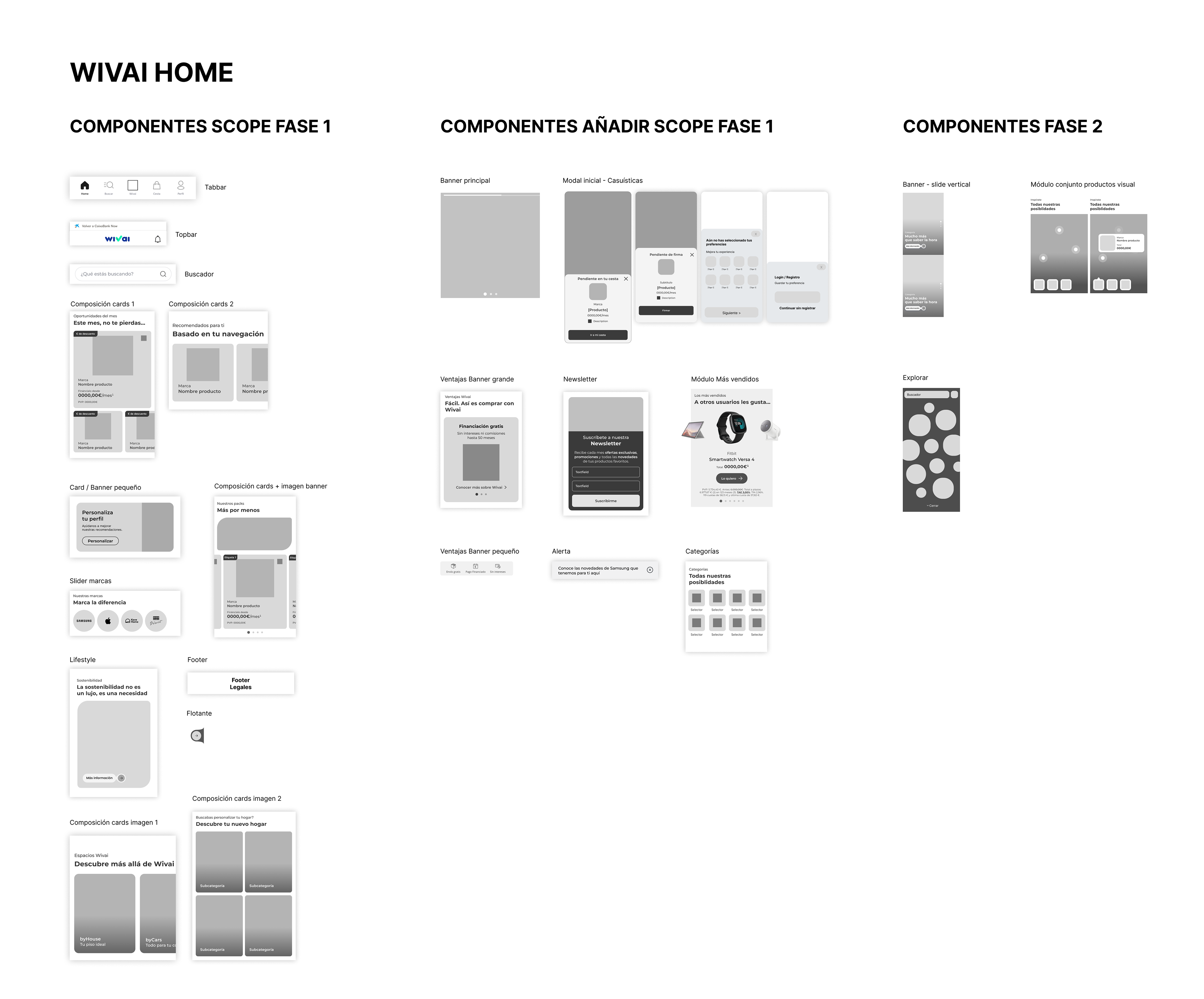
🧬Wireframes
🧪User testing
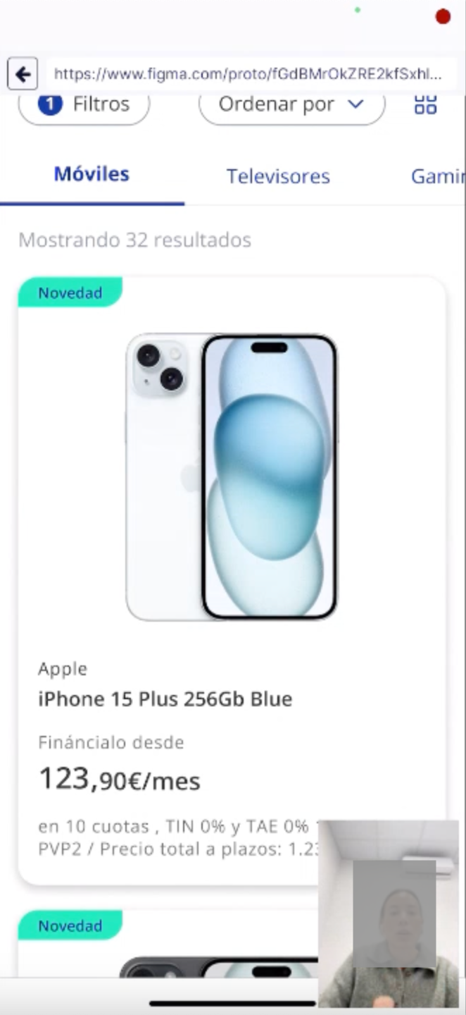
👩🔬 01. Validation that the Wivai Header can coexist with the CaixaBank Header, and validation of the navigation in App.
🏁General objective: Validate that the Wivai header on the Web is different from the CaixaBank header, and that they can coexist without causing confusion to users. We also want to validate the navigation in app, which includes the header 'Back to CaixaBank'.
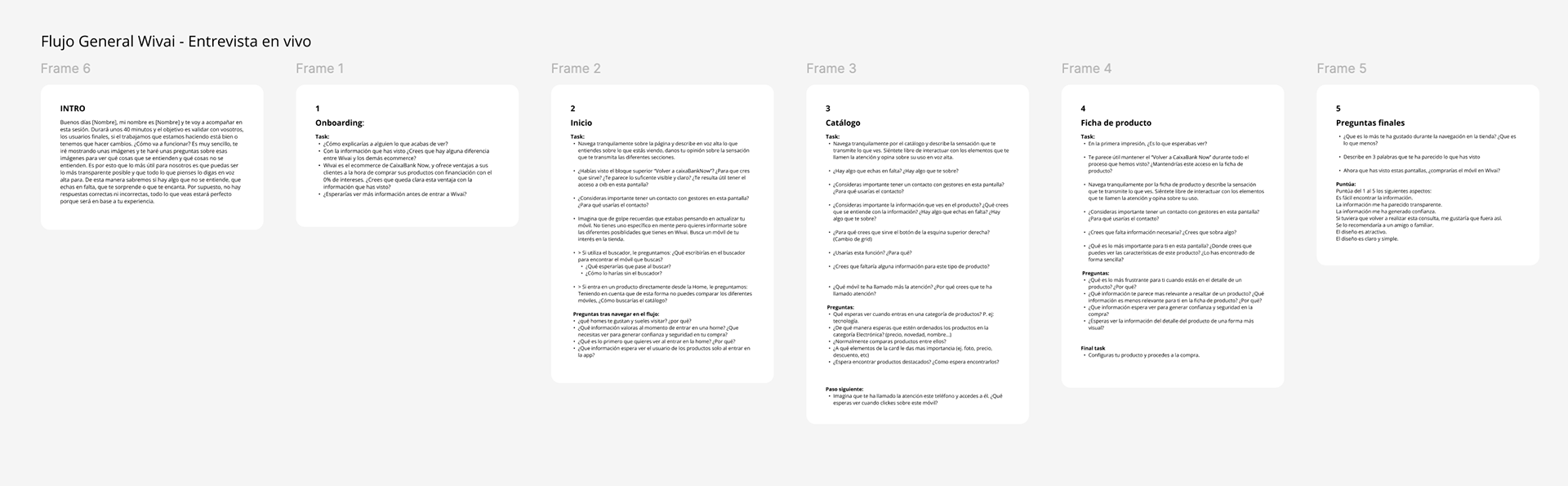
🔨Metodology: In person User testing with phone and web devices (10 users)
Test Steps:
Introduction:
Greeting and presentation of the purpose of the test.
Explanation of the task: "Today we are going to explore the new category menu design on our online shopping site. We want to know your opinion and experience as you perform some specific tasks"
Initial Questions:
Demographic questions (age, gender, online shopping experience level).
Questions about online shopping habits.
Menu presentation on web and app:
Show the new category menu design.
Ask participants to share their first impressions and observations.
Specific tasks on web and app:
Search for a specific product with the Wivai search engine.
Ask participants to perform specific tasks, such as finding a product within a category, changing the category, or exploring
subcategories. Observe the ease with which they navigate the menu.
Access "Cart".
Access "My Account".
Search for a specific product with the Wivai search engine.
Ask participants to perform specific tasks, such as finding a product within a category, changing the category, or exploring
subcategories. Observe the ease with which they navigate the menu.
Access "Cart".
Access "My Account".
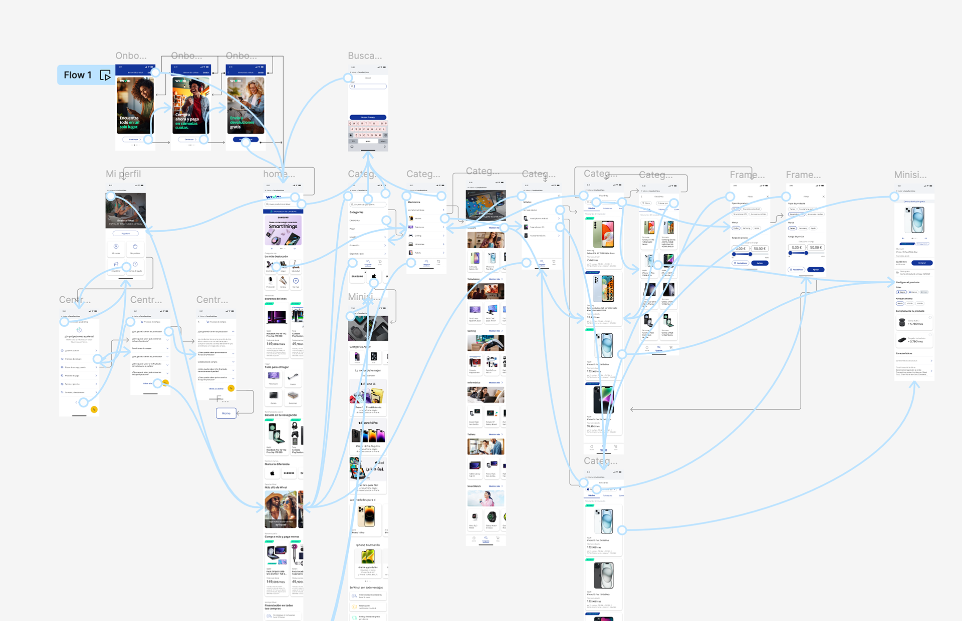
Prototypes
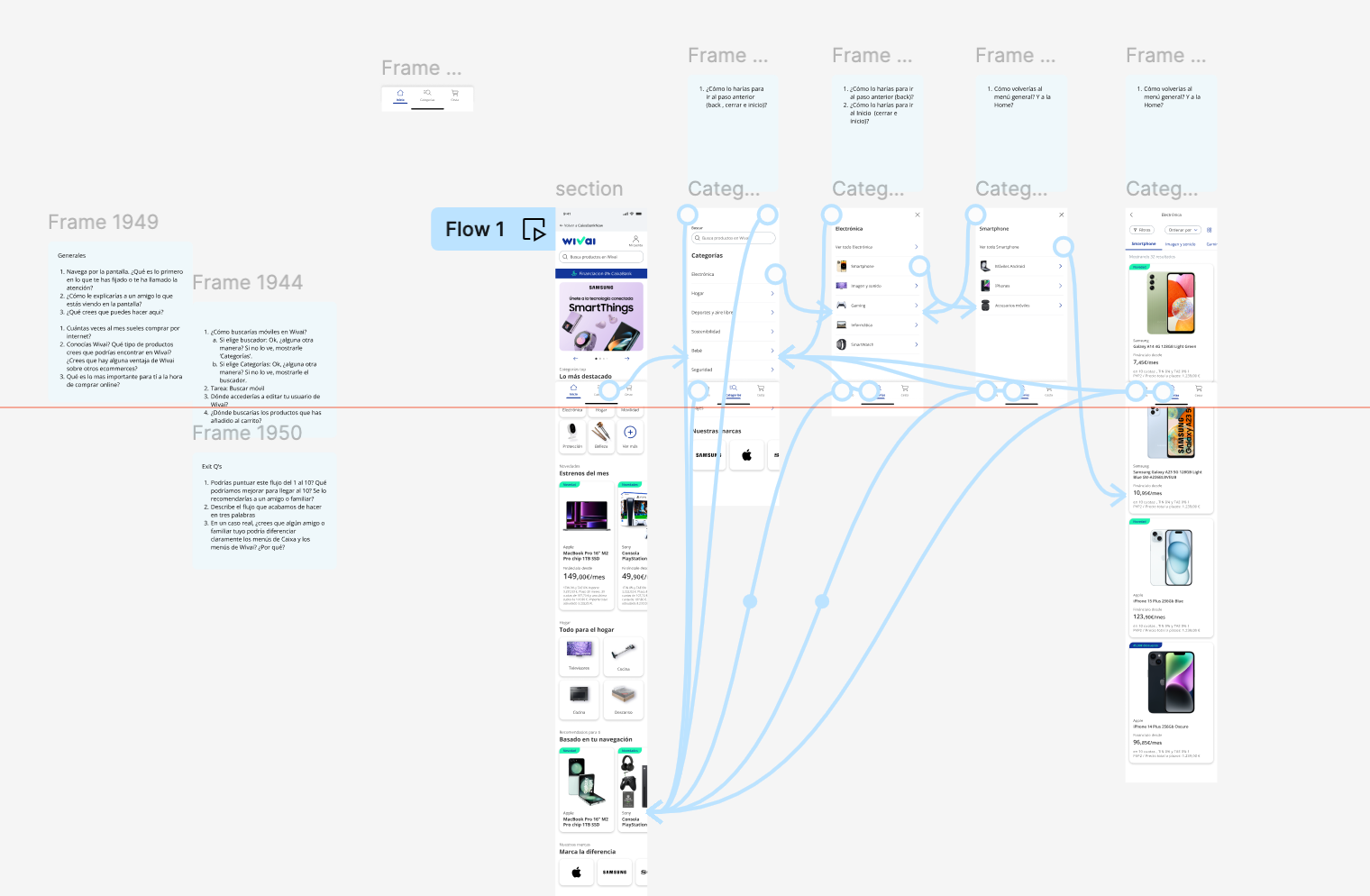
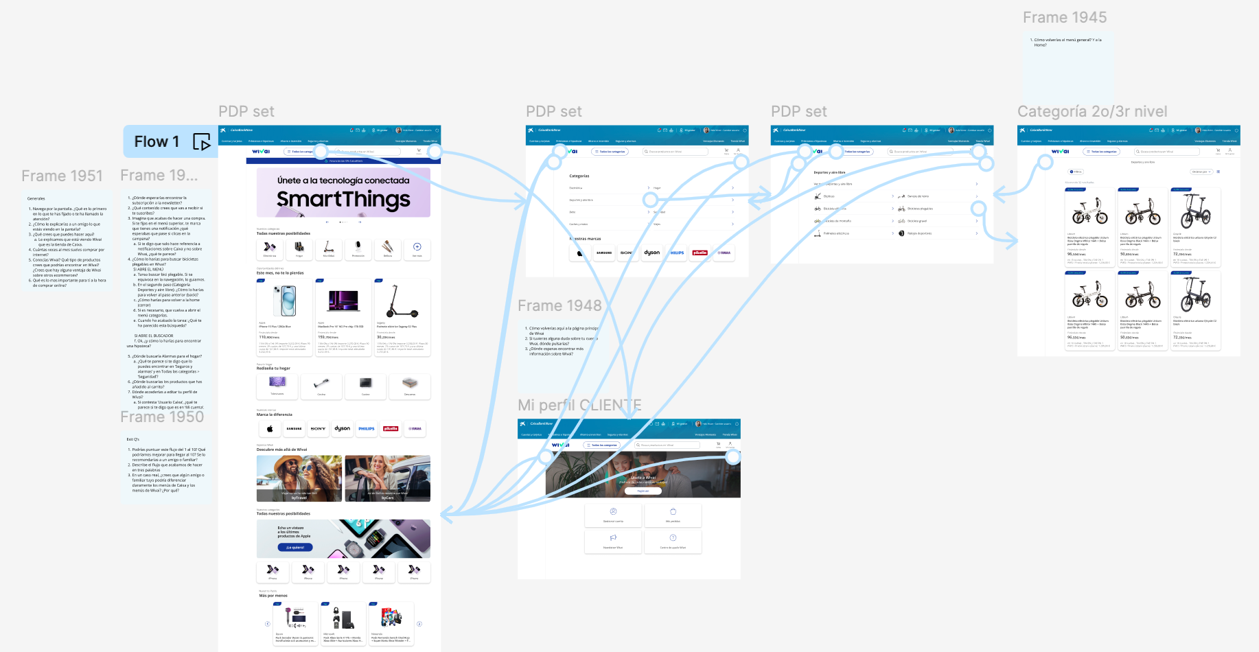
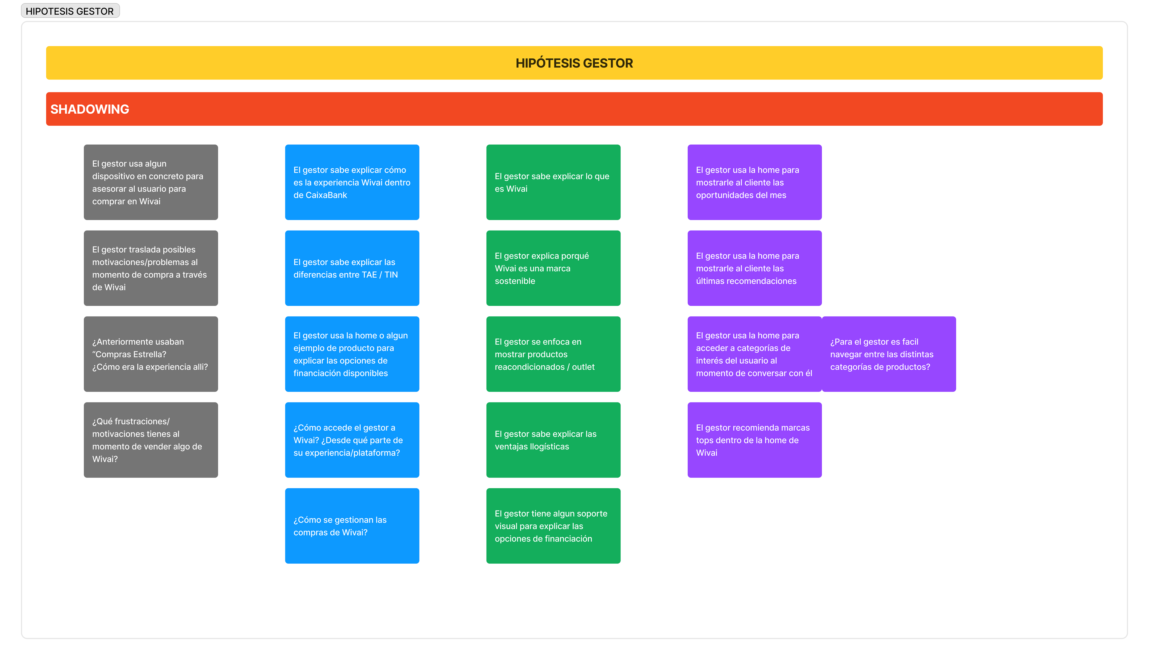
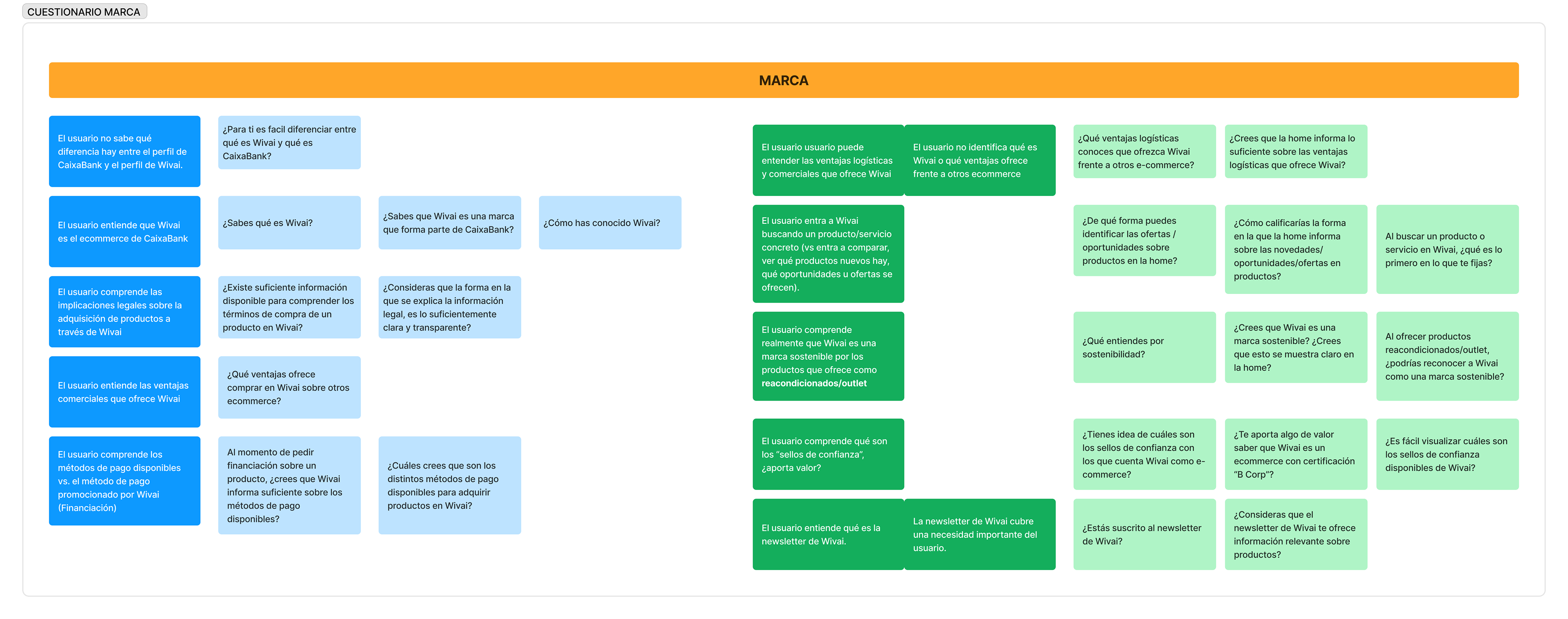
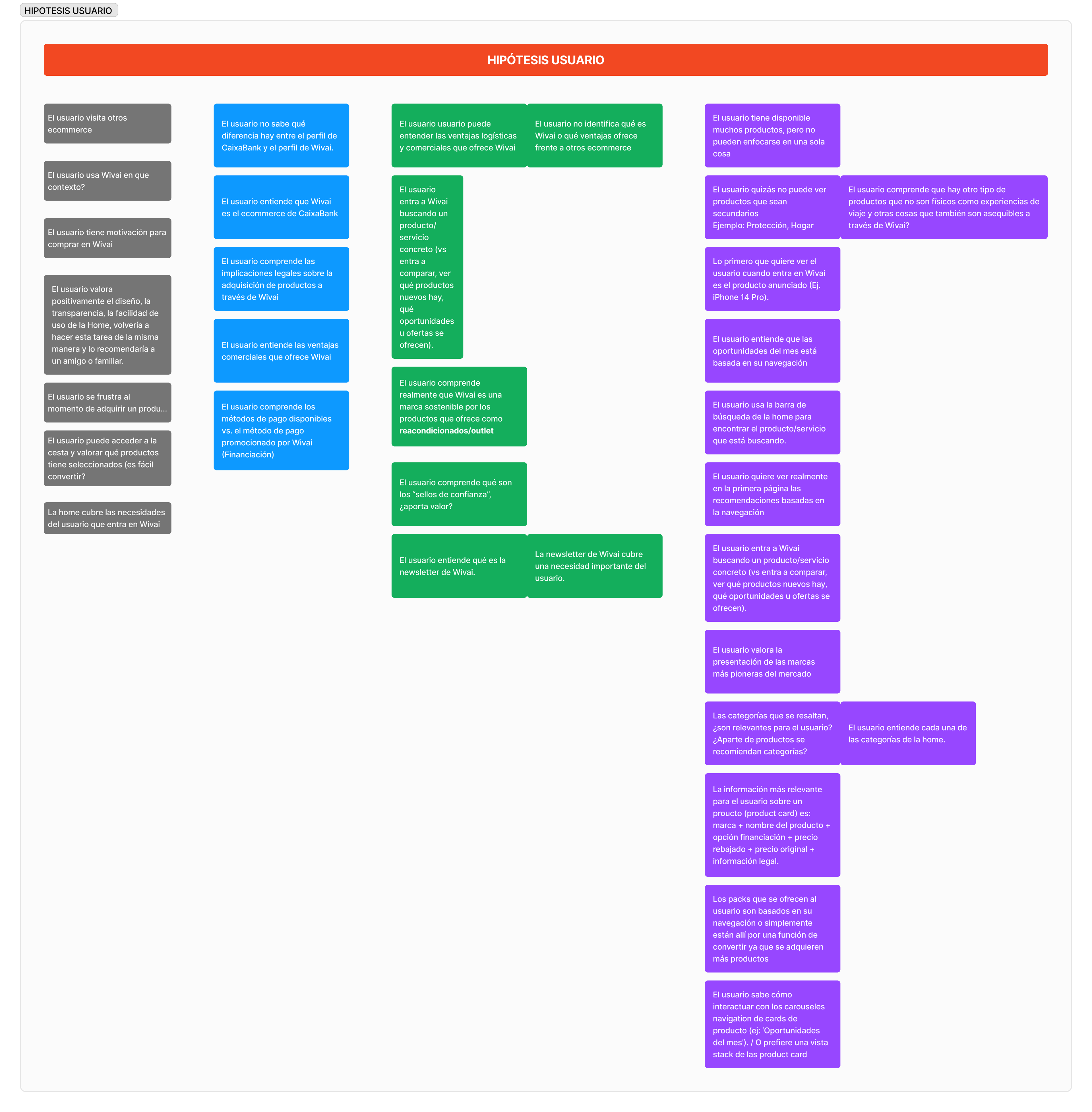
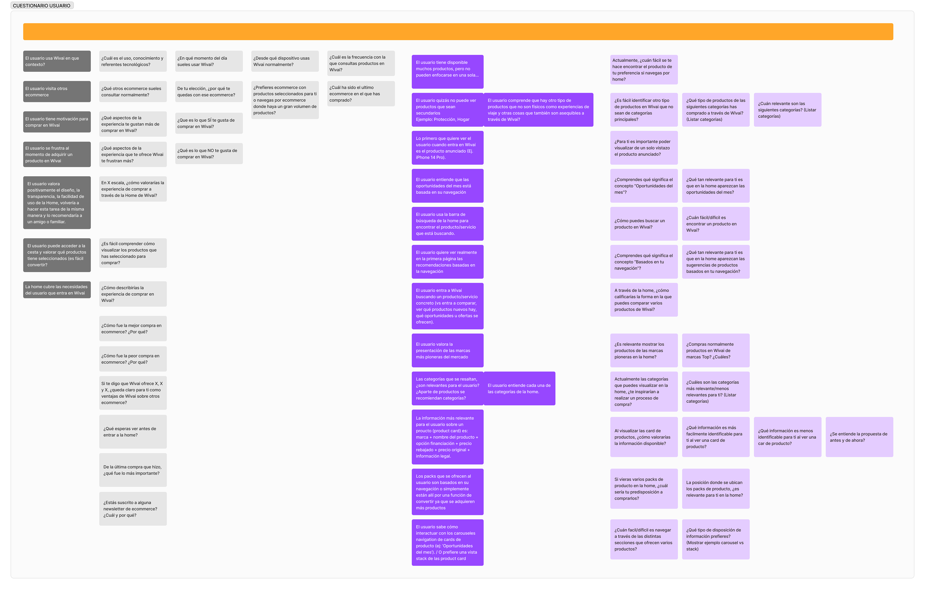
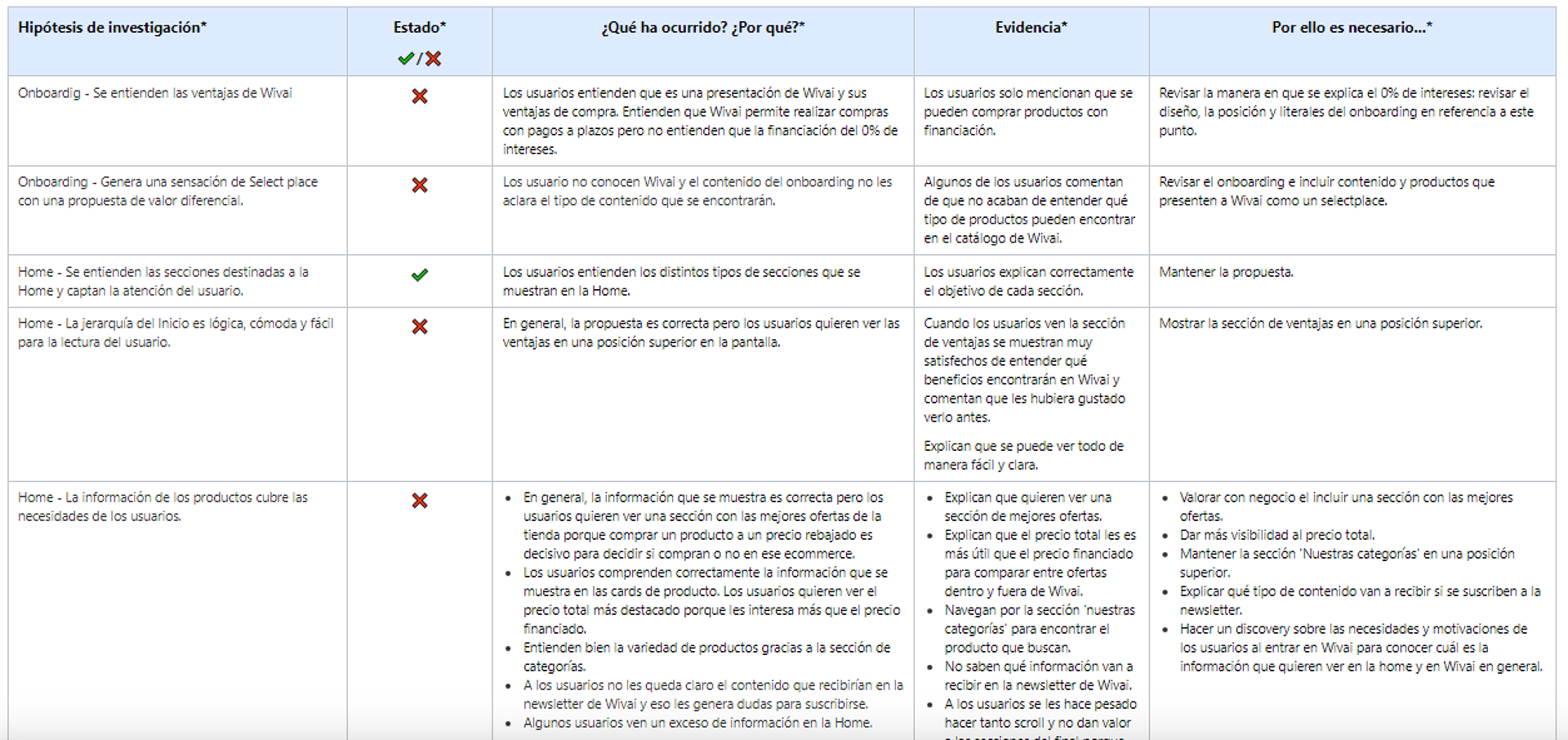
Hypothesis to validate
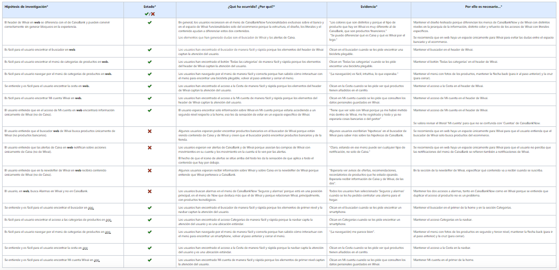
🔍Results:
Based on the test results, we validate that the UIX of Wivai navigation in coexistence with the top menu of CaixaBankNow on the web is correct and works without blockages. Taking into account the results and the context; the visits in home web represent 3% and considering the technical limitations that would mean creating a space only for Wivai, we conclude that displaying the content of Wivai within the main frame in the case of web is the most appropriate option.
The app navigation works correctly.
The app navigation works correctly.
Synthesis of results (summary January 2024):
On web it is detected that there may be confusion in the search engine and alerts, since when displayed together with the CaixaBankNow menu the teeth expect to find Caixabank and Wivai information aggregated.
On the web it is validated that the shape and location of the header facilitate access to the search engine, categories, shopping cart and my account.
In app it is validated that the shape and location of the header in home and navbar facilitate the access to the search engine, categories, shopping cart and my account.
👩🔬02.
Validation of the new design proposal for the upper funnel
🏁Objetive: Validate all the steps of the new proposal for Comunidades
🔨Metodology: User testing (8 users)
Script + Prototypes

🛬Results
In general, the proposal works well for the users.The following aspects need to be revised:
- Clarify the 0% financing
- Reinforce the selectplace image
-Emphasize the total price.
- Show the element "Back to CaixaBankNow only in the home page.
It is recommended to make a discovery test to know what are the needs and motivations of users entering Wivai in order to offer an optimal experience.
🧪Additional tests done:
Validation of Product Availability Notifications display
Discovery and validation of Filters and Ordering flows
Validation of the Newsletter subscription flow
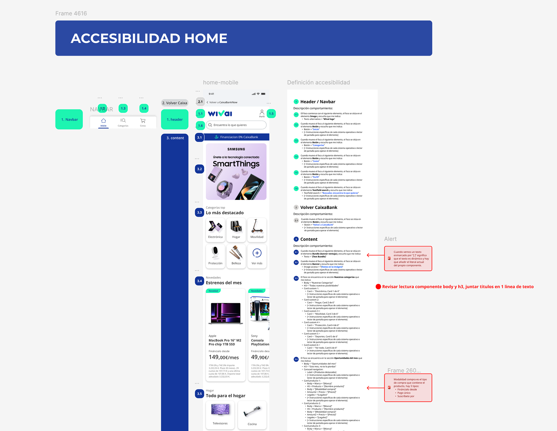
♿ Accessibility Analysis & Specifications
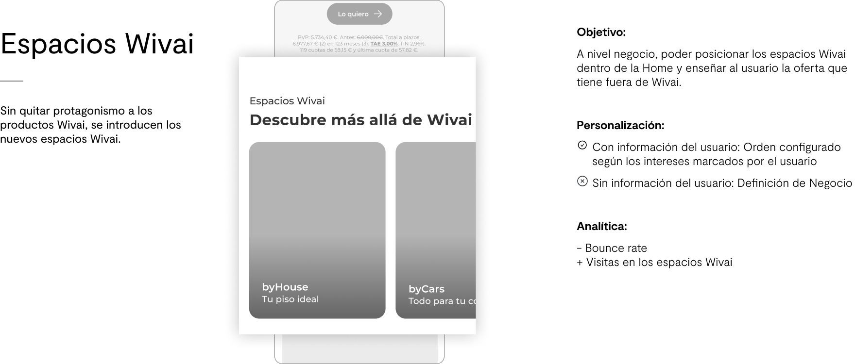
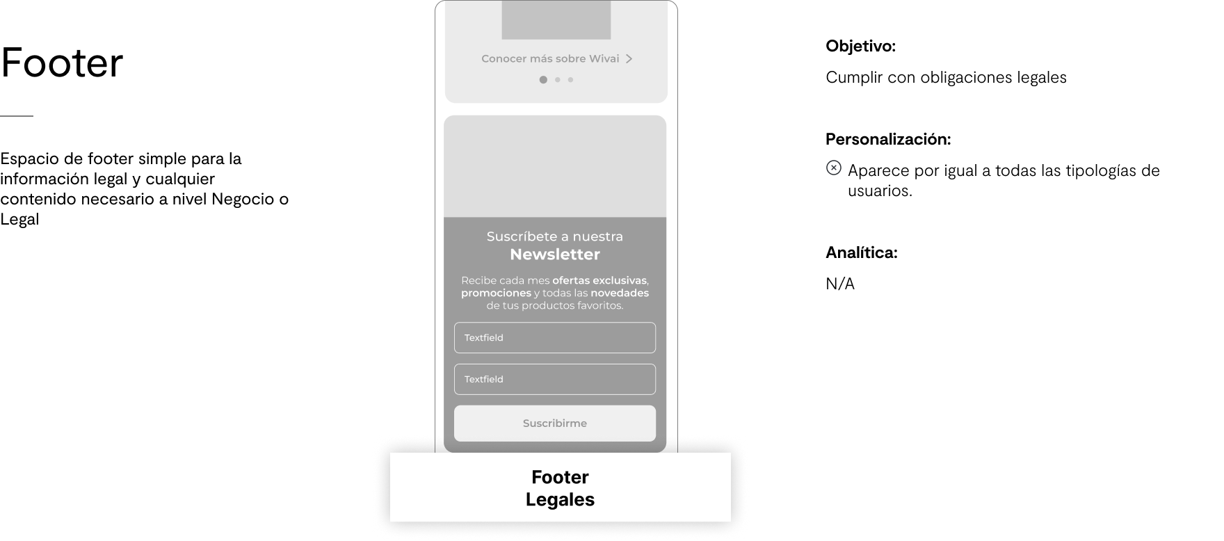
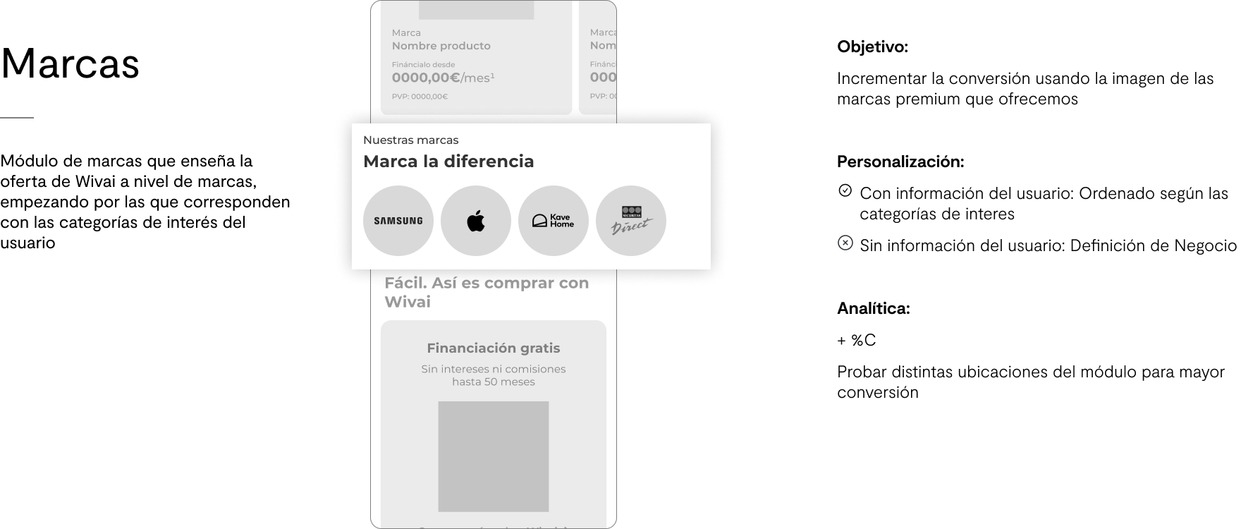
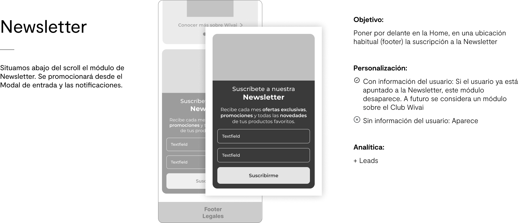
🌟Results Home for MVP
📌 Since the launch of the MVP, we have detected...
- Increased conversion from Home to checkout by 1.8% more.
- Increased user retention across the different modules
- Improved product perception (measured through user tests)
- Better iteration capacity of the products shown in the home page, since it is no longer necessary to develop each iteration, instead it is fed through APIs.
🔄 Points to improve in future iterations:
- Users reported that they would prefer to see the advantages of Wivai higher up.
- Through analytics we observed that most users search through the search engine, not the category menu, so we have proposed an A/B test in production in which the search engine textfield is kept fixed.
____________________________________________________________________________