📖 Context:
After time giving users the chance to select different color variants in products at the e-commerce, we have seen that in the APP version the sales of phones in the color variant set by default are sold at a higher rate than the other color variants.
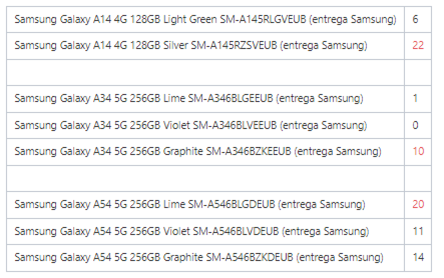
Sales from August 2023:
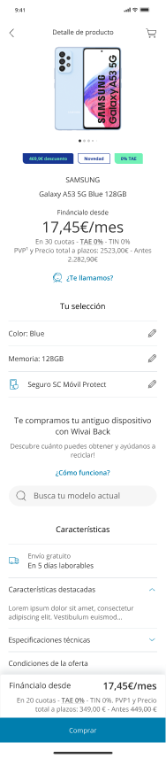
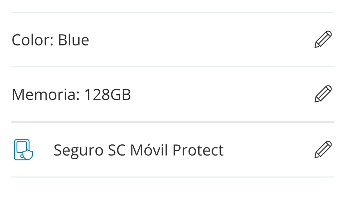
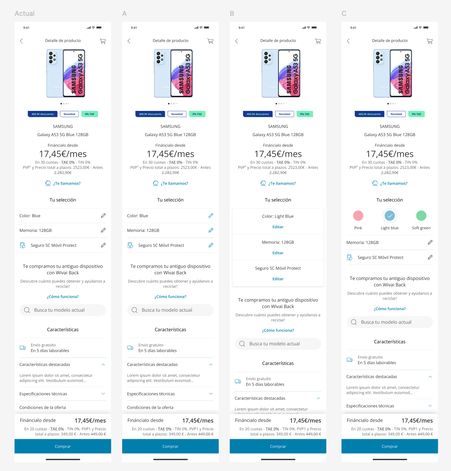
Current Design:
🔎Hypothesis:
Users have difficulty finding the current CTA to edit the variant.
The process of accessing another screen to choose a different color augments the cognitive load.
🏁Test Objectives:
Validate whether the current version is understood.
Check if there is a better alternative without the need for new developments (which were not available for Upper Funnel in this Design System).
👤User Profile
400 users (100 for each proposal)
🔨Metodology:
Test Think Out Loud + Click Test
Question:
Imagine you want to select your phone in the color pink, where would you click?
Current Design, Variable A (Pencil CTA highlighted in blue), Variable B (CTA with the word 'Edit'), and Variable C (CTA is a round color selector).
🛬Results
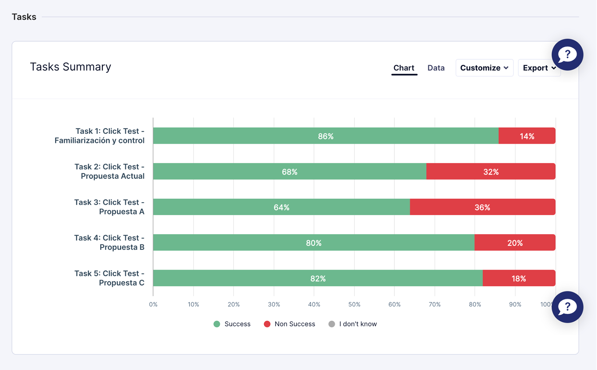
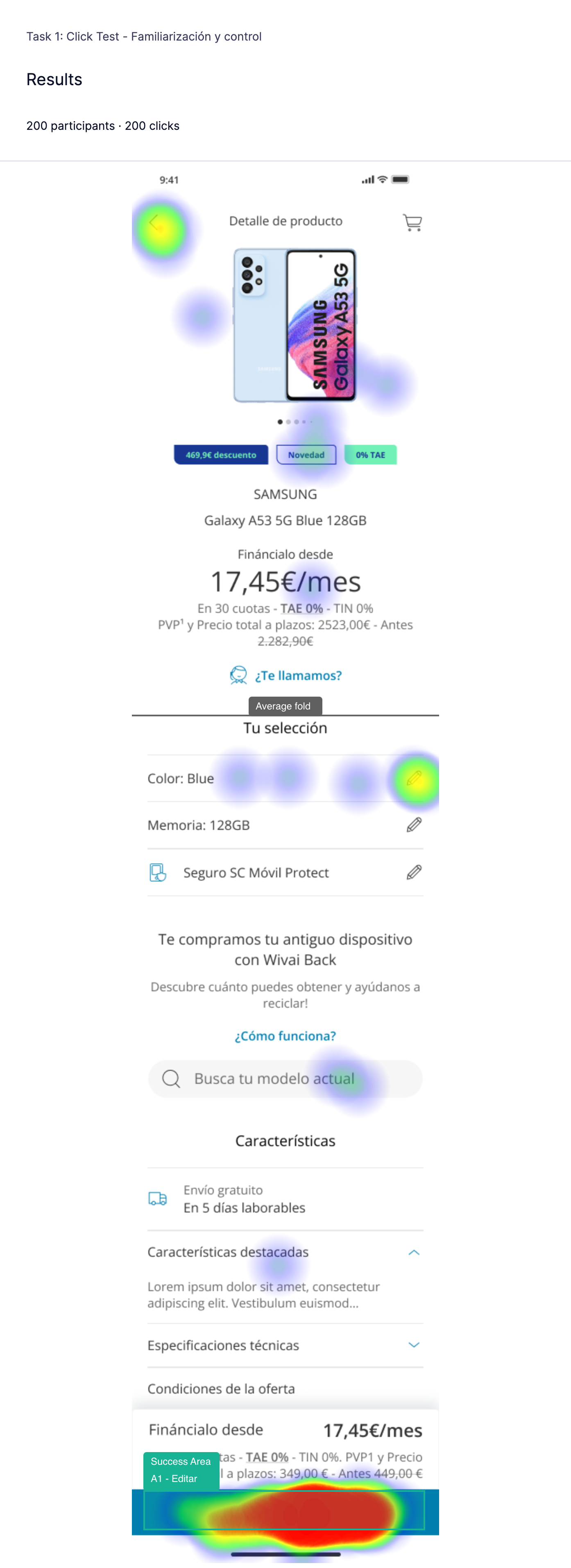
Control Version
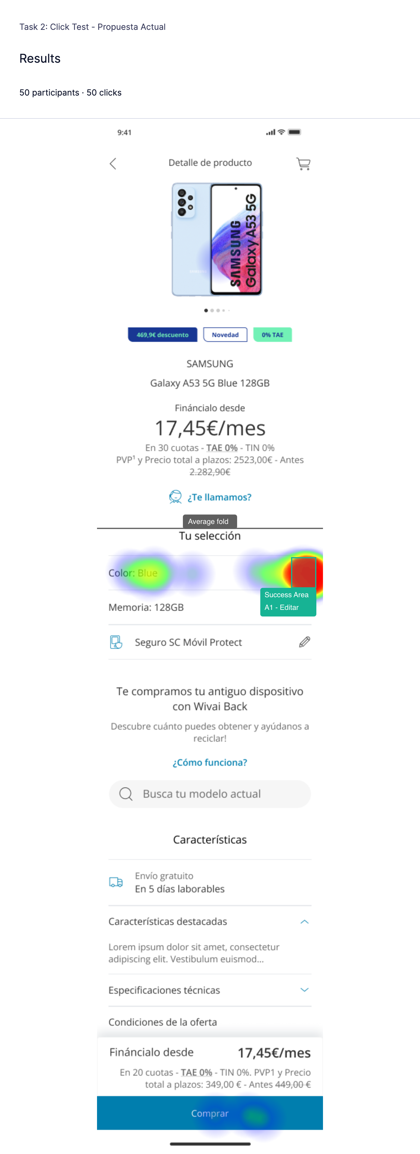
Current Proposal
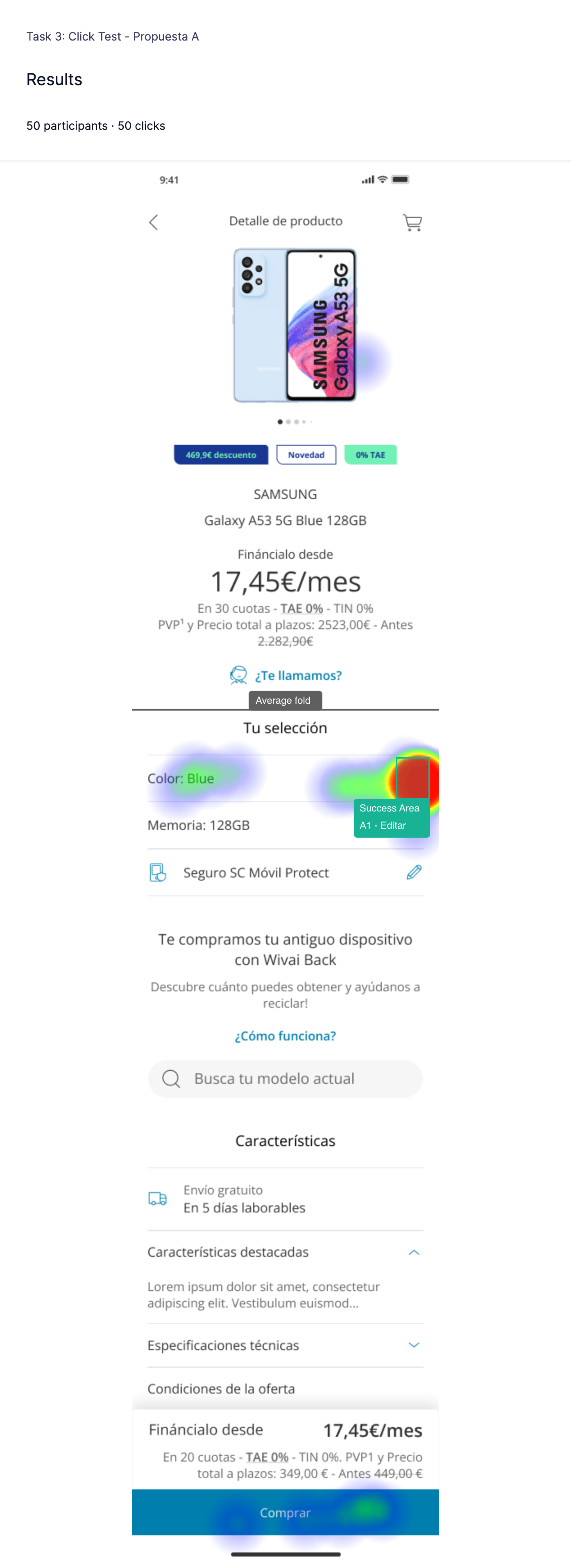
Variable A
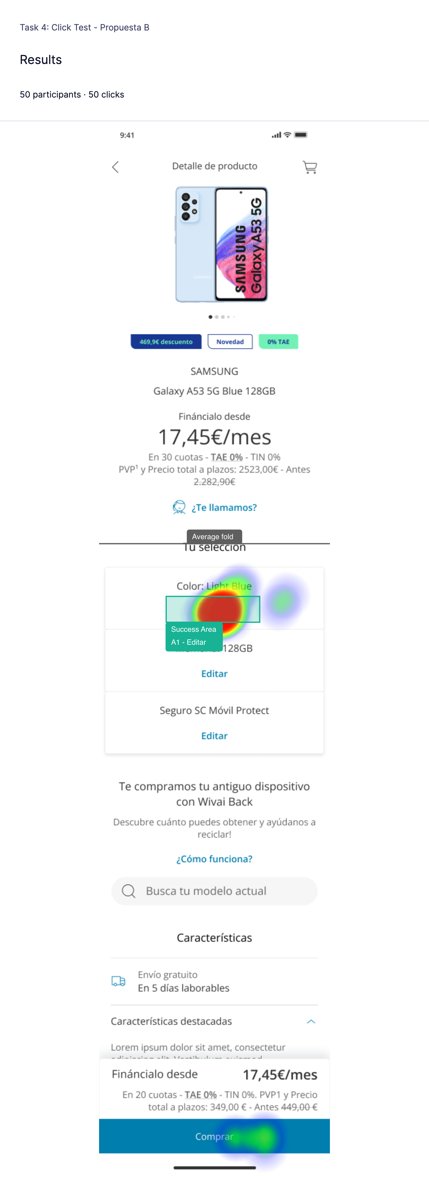
Variable B
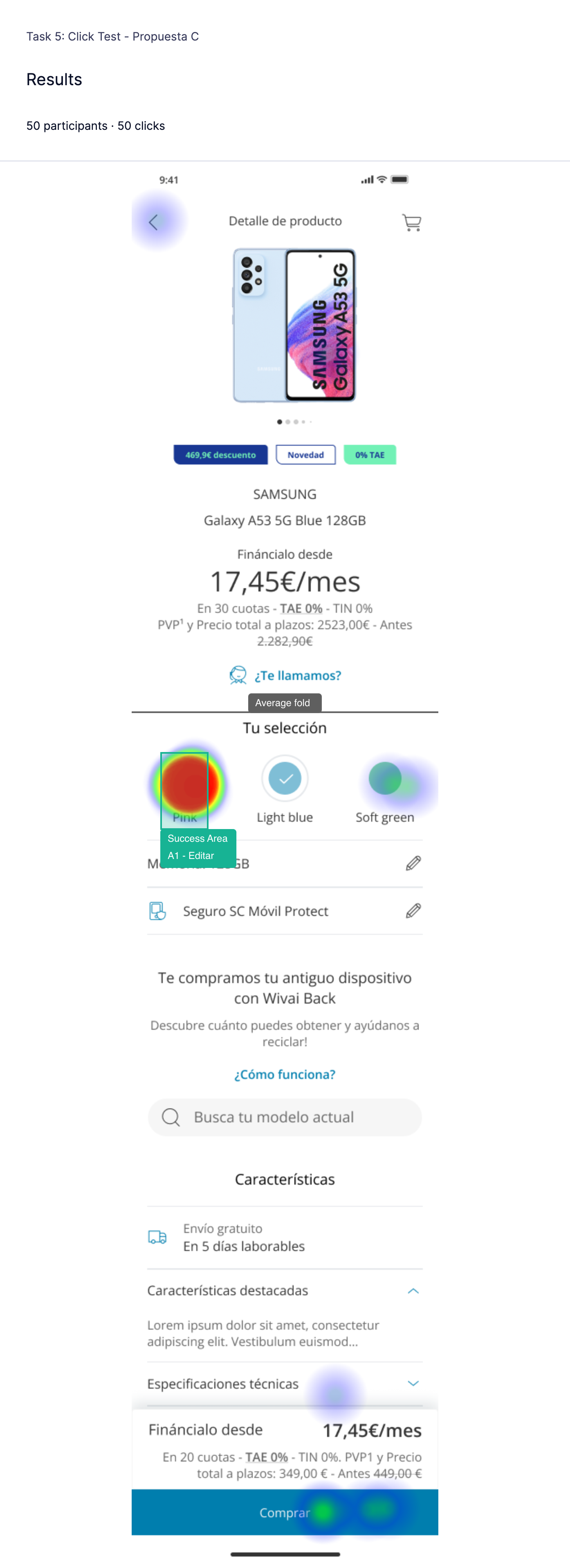
Variable C
The option based on colored circles (Variable C) achieves the highest success rate with 82%, because it is more visual and easier to identify.
Which of the proposals has better findability?
The difference in success rate (success rate is users who correctly complete the task of changing the color between the current option and the color picker of the blue pencil) is not very large (68% success for the current proposal and 64% for the color pencil). Yet, the success rate rises to 80% for the color picker in Variable B, and to 82% with the color picker in Variable C.
We believe that this is because the combination of text + color helps the user to see the options more clearly and to decide. The color picker in Variable B also stands out from the pencil option as it is a larger component with the CTA in bold and blue. We also assume that if a user does not speak English, it will be more difficult to understand the color text.
So seeing color-text or 'Edit' text will help them make a clearer decision.
We confirm that the findability improves over the current proposal in proposals B (color picker
Edit") and C (color picker text + color).
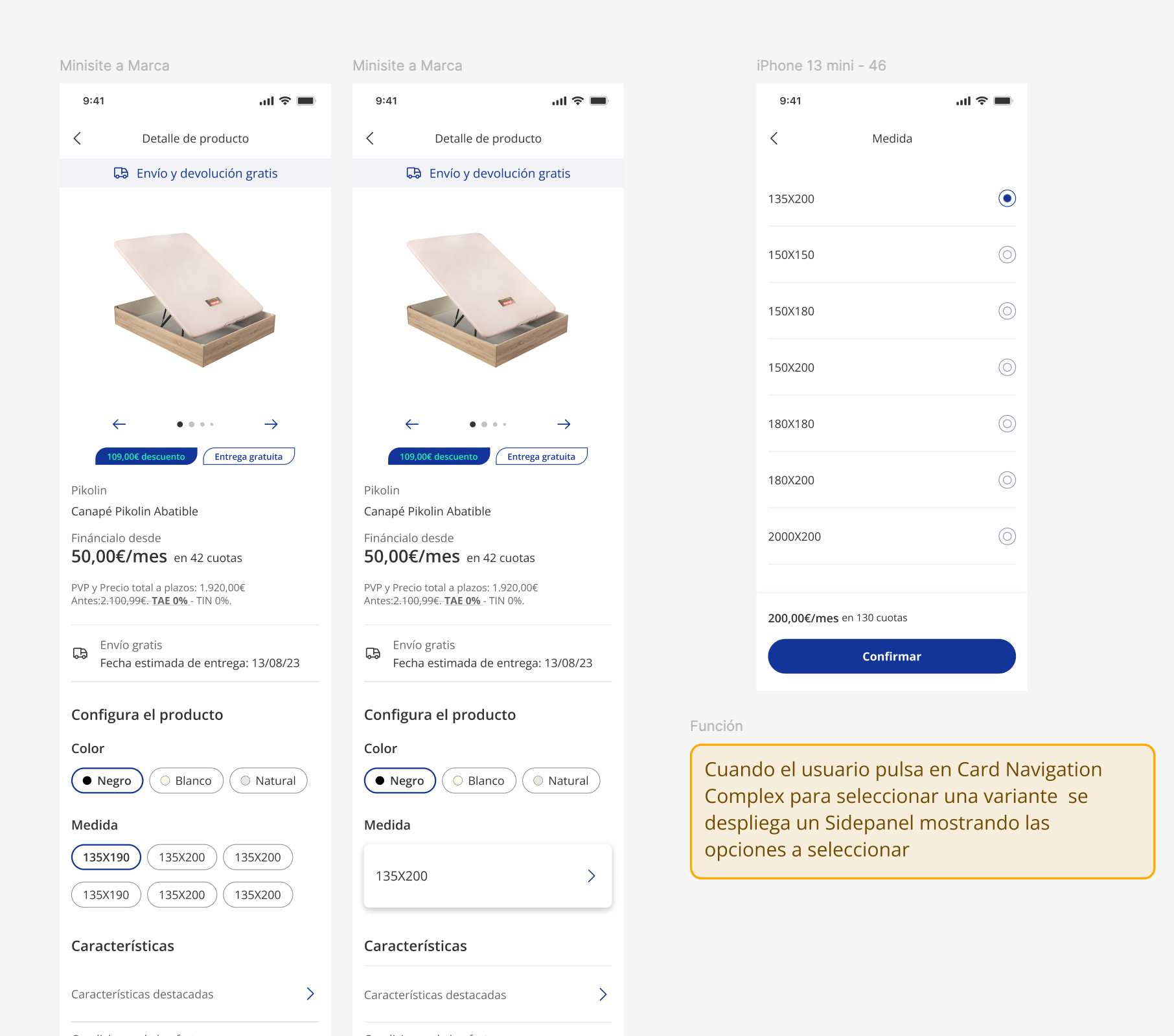
▶️Points of Action Proposed:
Implement a color selector that shows the color alongside the name of the color, as this option is the one users found easiest to find.
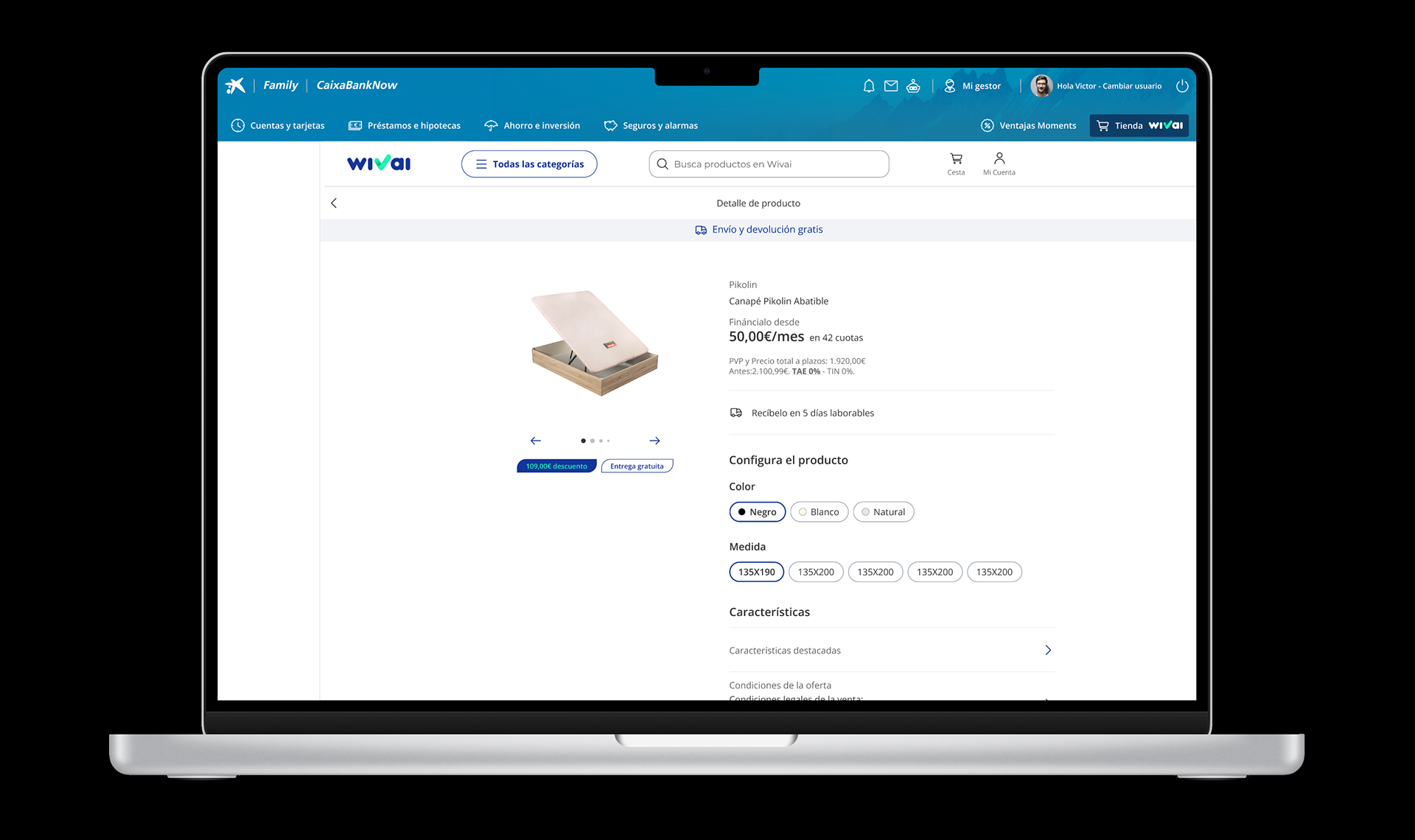
✅Results applied to design: