📖 Context:
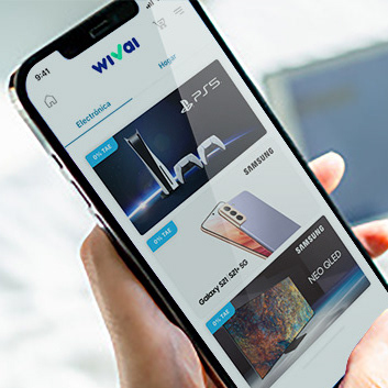
Currently the checkout of Wivai in the CaixaBankNow App is designed using a technology called MCA (App) and MyDomain (Web). These technologies will be discontinued since they are very outdated, so currently no new components can be evolved and no new components will be created.
From January 2024, a Project called EPIC begins to re-design the checkout incorporating many usability improvements. The new checkout will be developed using an Open Front technology, accompanied by a new Design System called Omnia. This will mean that now the checkout content will be fed through APIs, which will reduce development times and make ongoing improvement easier.
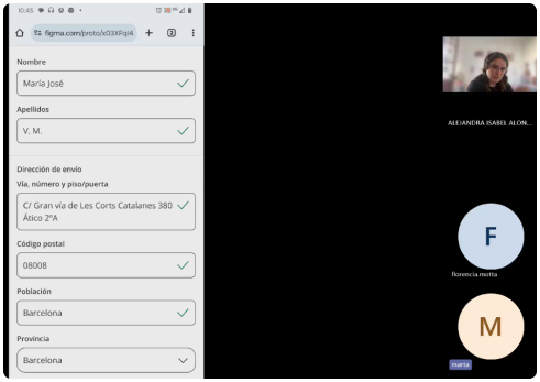
With this re-design, every step of the checkout was thoroughly tested. This is an example of validating the new design of the Shipping details form.
💚 Advantages of the current design
All information is fed through their CaixaBank account, so there is no need for users to input their personal information.
💔 Problems with the current design (seen in previous testing)
The checkout process is perceived as long and limited.
Users are unable to edit their contact details for shipment
Users are unable to edit their contact details for shipment
🏁Test Objectives:
Validate the usability of viewing and editing contact and shipping data.
Explore possible improvements and functionalities to implement.
Assess ease of use and security perception.
Explore possible improvements and functionalities to implement.
Assess ease of use and security perception.
🔎Hypothesis:
The user understands that the data shown are those of their account and are not editable.
The user understands that they can add different shipping data and can see it correctly after saving the form.
User sees previously saved addresses and can select a different one.
User can add a new address.
The user can modify the billing address correctly.
The user understands that they can add different shipping data and can see it correctly after saving the form.
User sees previously saved addresses and can select a different one.
User can add a new address.
The user can modify the billing address correctly.
👤User Profile
Men and women, between 35-50 years old.
CaixaBank customers, who have made a purchase via cell phone in the last month.
🔨Metodology:
Usability test to 6 users (30 mins per user).
Prototype & Script:
Doing the interviews


🛬Results
The shipping details form screen is perceived as simple, intuitive and useful as it allows you to modify shipping and billing details allowing you to receive products in different locations and to different recipients.
In general, it is understood that the shipping data being modified is specific to the current order and has no impact on the CaixaBank or Wivai bank account information.
The need to visually treat all editable data in the same way was detected, as the use of bold letters in certain contents caused confusion as to which ones are editable.
➕Additional learnings
The design of the shipping and billing data card with the address in bold leads to confusion for some users who think that this is the only editable data.
Users indicate that they would like the ability to add comments about the shipment such as, 'drop off at doorman', drop off with neighbor - shipment remarks.
Users understand that this data will only affect this order and will not modify their Caixabank data.
Several users mention that they would like to see delivery information at the time they are choosing the address, to make it easier to decide where to send the order.
Several users believe that the added address would be saved even if they don't click 'Save changes' because it says that the address has been saved (consider a copy change).
One user feels that the dropdown arrow looks too much like the green check and can be confused as another check.
Users are frustrated that data is not saved after filling out a form if they don't hit 'save changes', but they understand why this is done.
Users like to receive Reaffirmation feedback of the action they have taken (i.e.: toast message).
- One user comments that he would find it useful to have a 'dark mode'.
- One user comments that he would find it useful to have a 'dark mode'.
A user mentions that it would give him more security to see during the process that this is Caixa's e-commerce.
▶️Points of Action Proposed:


